Trending

Wall posters – how to choose them for your apartment?

|
It takes approx. 4 minutes to read this article

Posters are becoming an increasingly popular interior design element. And this is mainly due to the high quality of prints that most of today’s manufacturers offer. How to choose posters for your apartment? In this article we answer this question.

The simplest and most effective option for decorating the walls in the apartment are posters. With a huge selection of themes, you can easily change the interior of any room and give it individuality

A few words about the purpose of posters

The main function of posters is to highlight the interior of a room. They can really liven up the apartment and make it more suited to your taste. The final effect will largely depend on how you choose posters and where you hang them. So how do you choose a poster and incorporate it into the interior of your apartment?

How to choose a picture for a poster?

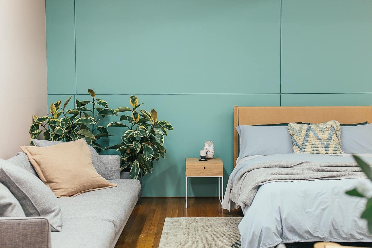
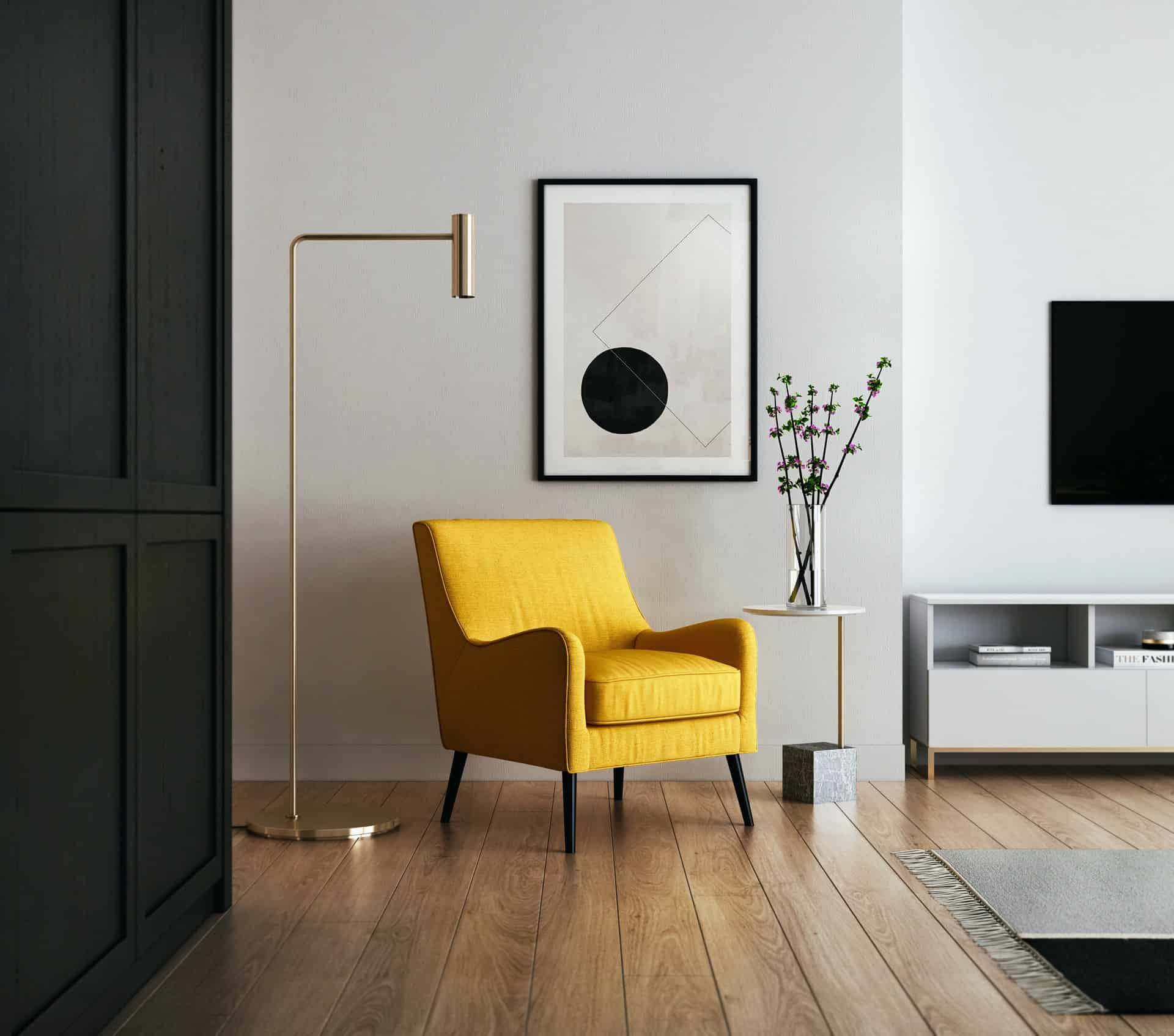
Not every poster will be equally suitable for every room. You must try to take into account the atmosphere of the room. An abstract will be quite suitable for placement in the hallway or living room, as long as the color scheme and style match the rest of the room, and for the room of a young man a picture of a car or a motorcycle will fit. On the other hand, in the bedroom calm floral motifs, landscapes, still life, Japanese motifs or posters with a slight erotic touch will work. Battle scenes and aggressive themes, which introduce a state of anxiety and tension, are not suitable for this room

Color spectrum

The first step is to choose a color palette according to your personal preferences: do you like color posters or black and white? The latter are more suitable for equally monochromatic interiors. When deciding on color photos, follow one of the proven selection criteria:

  • in the color of the interior – in this variant posters should merge with the color scheme of the room. So, for example, beige and green posters in a beige room with green details will remain almost invisible, but match the rest;
  • play of contrasts – bright, flashy works, which attract attention, work on the principle of combining contrasts: red paintings in a green room, black posters in a white living room;
  • abreath of novelty – in contrast to the second scheme in this concept there is still color, but it is diluted with a fresh new shade. Example: a gray living room with yellow accents complemented by a yellow and blue poster.

Leitmotif

When choosing a poster for the wall, it is worth thinking about the theme

Popular themes include:

  • abstract – circles, squares, lines, stripes, outlines of any shape – they do not carry any message, but they are great for attracting attention. When choosing one abstract poster, do not complement it with a landscape or portrait – all the others are better to choose in the same style;
  • nature – the theme includes: landscapes, motifs (plant leaves), herbariums (dried leaves, flowers under glass), images of animals. Tropical leaves or snowy landscapes are often used in the Scandinavian style, in modern interiors a seascape is preferred, in turn, standard landscapes and reproductions of famous paintings fit the classics;
  • retro – they are distinguished by colors, fonts, design techniques. Most often used are advertising posters in subdued colors: these can be both retro ads (cars, clothes) and the American poster “I want you to join the army”. In some cases, old photographs, circus or movie posters will be appropriate;
  • artistic – contemporary art, pop-art, impressionism, realism. In modern interiors it can be a good idea to use reproductions of contemporary artists, and in the industrial style – original posters in the style of pop-art;
  • cinematic – as a basis for the idea for the poster you can choose a shot from your favorite movie; in the children’s room often used are shots or images of cartoon characters.

The correct placement of the poster is also important

If the poster is relatively large, it should be placed on an equally large wall, without additional posters hanging next to it. The wall at a distance of 20 cm from the furniture and the corner of the room and 40 cm from the ceiling should remain free. Otherwise, the poster will look too big for the room, i.e. a bad choice.

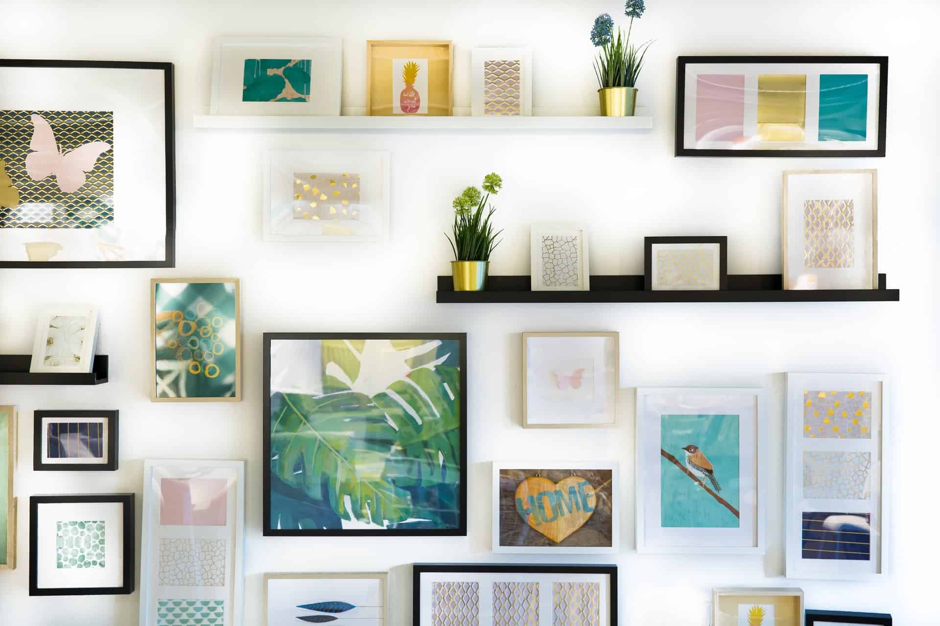
If you have several small posters, it is worth combining them into a composition. It does not matter if they are in a different style and color. In this case, you can put them in frames, but the frames must be the same – then the composition will look consistent. In the center you should place those posters that you would like to focus on.

Photo by Jonny Caspari/Unsplash

Add comment

Your email address will not be published. Required fields are marked *

*

8 + fourteen =

Latest articles
Recommended articles
Nurturing Mental Well-being in the Digital Age: A Guide for the Vibe Tribe University
|
Nurturing Mental Well-being in the Digital Age: A Guide for the Vibe Tribe University
In today's digital era, where the Internet permeates every aspect of our lives, it's crucial to recognize the impact it can have on our mental health.
How Can Banks Optimize Financial Derivative Strategies Through Effective Hedge Accounting?
|
How Can Banks Optimize Financial Derivative Strategies Through Effective Hedge Accounting?
Explore strategies to enhance bank profitability through advanced hedge accounting methods. Learn about derivative risk management and compliance tactics to optimize financial outcomes.
The Most Famous Italian Wines You Must Taste Before You Die
|
The Most Famous Italian Wines You Must Taste Before You Die
Everybody has the desire to taste Italian wine, at least once in their life. Italian wine is famous throughout the world and it’s on the top of the list when we talk about wine countries in Europe and worldwide.